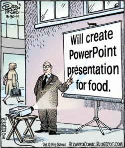
A colleague of mine is preparing for her first webinar and is embarking on the daunting task of create a PowerPoint presentation that will not only grasp the viewers attention, but leave them with something meaningful and relevant as a takeaway. She did all her due diligence. She wrote an abstract, gathered her notes and prepped her story, but somehow translating that into PowerPoint left her at a standstill. Her next move - ask Karen for help!
I wanted to provide some examples I ventured to Slideshare to conduct my search. As you can imagine, sifting through thousands of PowerPoints is not the best use of my time so I instead focused on locating “how to” guides, starting with one of my favorites – Death by PowerPoint. The selection I provided to her is the same I am sharing with you – a collection of five presentations that show what to do and what NOT to do. If you have any others to share, please do!
 Death By PowerPoint: This is one of my favorites and was first introduced to me by a friend and colleague, Tami Forman. It tells a clean and simple story while providing a strong action plan on how to create your next presentation. It’s also available in other languages.
- Presentation Secrets of Steve Jobs: If you are a serious presenter (or writer), get the book. This presentation however, is a perfect example of what NOT to do in a presentation. But, it does provide a good excerpt of the book. Think of it as PPT Cliff Notes (or Spark Notes as they are called today). Did I just date myself?
- Why Most Presentation Suck: Here you’ll get simple and effective advice based on five main questions every presenter should answer.
- Steal this presentation: This presentation provides a more tactical view of how to create a killer PowerPointt. This is super helpful when you are actually in the process of creating it, not just thinking about it.
- You suck at PowerPoint: The subtitle is “5 Shocking Design Mistakes You Need to Avoid” so I think that sums it up right there.
The one thing that all of these presentations have in common is that you don’t need a voice over. When creating a presentation for a webinar, make sure you include information on the slides that enhances your verbal presentation, but is also comprehensive and useful enough for readers to find value without the benefit of your colorful commentary. It’s a delicate balance that is hard to achieve, but you can do it once you get the hang of it. Remember, practice makes perfect!
RANT to myself: I used the word presentation or some variation thereof about 16 times in this post.


